Abstract Image – Tension

This photo was taken to represent tension. The idea is that the lava rock is encompassing the sea horse and it cannot escape. There is slight motion in the image as the lava rock is moving to take over the sea horse.
Congestion Edited

Once again I maximized the use of editing the image in camera raw. Starting with the basic pallet, I decreased the temperature to -20. This makes the image feel colder. I then wanted to drown out the distracted wall in the background. I did this but increasing the exposure to -0.65, increasing the highlights to +85, and increasing the whites to +16. I decreased the contrast to -23 to dull the image. This added to the dreadful feeling of being congested. Next, I decreased the shadows to -43. This darkened the surrounded zombies and area, in order to help bring the focus to the zombie wrapped in barbed wire. I then went to the tone curve pallet and decreased the darks to -8. This helped to further bring focus to the barbed wire wrapped zombie. Finally I went to the HSL/grayscale pallet. Here I decreased the yellows to -6, in order to really dull out the background. Finally, I decreased the greens to -100. This eliminated the distraction created by the fact that the bases of many of the zombies were green.
I then opened the image in photoshop simply to crop the image on a 1×1 ratio.
This image also turned out exactly how I imaged it prior to shooting and editing. The depth of field really adds to the idea of congestion. The dullness and cold feeling produced after editing the photo also enhance this principle.
Abstract Image – Congestion
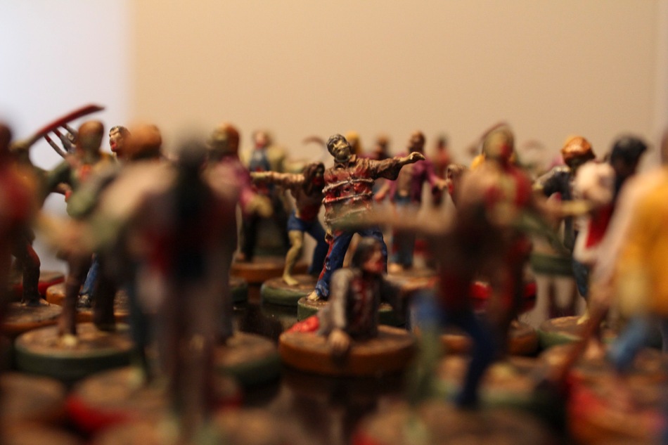
This is the original image from my idea of congestion. I hand painted these Zombie figurines for one of my favourite board games, Last Night On Earth. The idea behind the image was that there was so many zombies that there is no place for the one in the middle to go. I used depth of field to focus the image on the zombie in the middle. I chose this particular zombie to focus on because he is wrapped in barbed wire. This suggests that he is already congested. My final edited version will be posted shortly.
Bold Edited

I did a lot of work in camera raw and Photoshop to transform the original image into what appears in the final composition. First I’ll discuss the changes that I made to the image in Camera Raw. Under the basic pallet, I raised the temperature to +14. This brightened the eye while making the image warmer. I brightened the image slightly by raising the exposure to +0.15. I then added definition to the eye by raising the contrast to +63, decreasing the shadows to -23, and increasing the clarity to +51. The highlights were raised to +27. This adjustment lightened to facial features around the eye, allowing the viewer to focus on the eye itself. I then raised the whites to +14 to ever so slightly brighten the white part of the eyeball. Next I decreased the vibrance to -23 and the saturation to -3 in order to help eliminate the orange colour that appeared after adjusting the contrast.
On the tone curve pallet, I raised the lights to +7 to lighten the facial features. The darks were decreased to -8 in order to add a little definition around the eye. Lastly, the luminance was increased to +59 to blur out the background facial corners.
I then took the image into Photoshop. I started by cropping the image on a 1×1 ratio. Then, I used the quick selection tool to isolate the coloured part of the eye. I added a hue/saturation layer to everything but the coloured part of the eye amd adjusted the saturation to -71. This dulled out the background, bringing the focus of the viewer to the boldness of the eye. I then added a vibrance layer to the background and adjusted the vibrance to +36. Next, I added a vibrance layer to just the coloured part of the eye. I adjusted the vibrance to +100 and the saturation to +5. This allowed the eye to really pop, bringing the focus of the viewer to the boldness of the eye. Lastly, I used the smudge and blur tools to blend the edges of the vibrant and saturated eye with the white part of the eye.
All in all the image turned out exactly how I imaged and wanted it. I played around with the idea of changing the colour of the eye to blue (and even made a copy of the image with that change). However, I felt that the brown blended better with the image and really gave it that bold feeling that I wanted.
Abstract Image – Bold

This photo is one that I shot to represent bold. When taking the shot, I ensured that the subjects eye was wide open as to add to the concept. My edited version will be posted shortly and I’ll run through what I did to enhance the image to portray the concept of boldness.
Kaleidoscope

Today in class we did a Photoshop tutorial. It was a great reminder of some skills that I previously had, as well as an opportunity to learn new techniques.
I learned many commands to use in Photoshop in order to be able to be more efficient when editing an image.
The following image was made by taking an image and cropping in at a 1 x 1 ratio. I then used the polygonal lasso tool to eliminate half the image (leaving me with a triangle). Next I increased the canvas size to double the original size. I then placed the remaining part of the image to the top corner. The layer was then duplicated and flipped horizontally. That was then flattened (using control e), duplicated and flipped vertically.
I then proceeded to copy the layer, rotate, and shrink the image. After the image was complete, I then added a hue/saturation layer to make the image saturated. A brightness/contrast layer was then added to make the image pop. Lastly, I adjusted the colours to highlight the blues and yellows in the image.
Overall I love the end result and feel that one is actually looking into a kaleidoscope.
Abstract Image

This is an example of the work we did in class today. We were learning about abstract images and how to create ideas using 4 black boxes. This photo is my composition of the word tension.
1st Composition
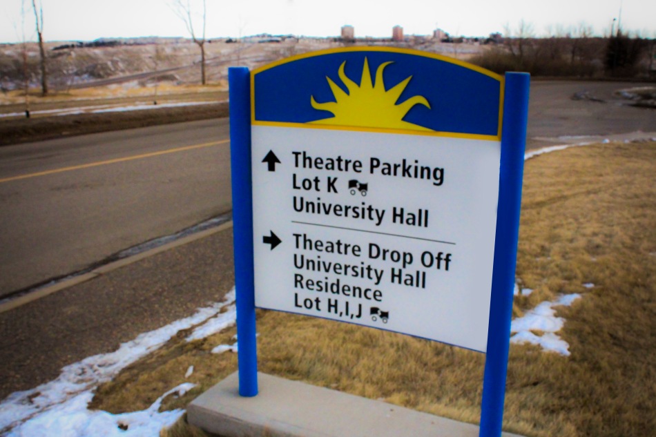
This is the final copy of my first ever composition. Having not take New Media 2005 I was unsure of where to start with this assignment. I wanted to dispaly an image that represented the need to make choices everyday. Every day of our lives is full of choices. Our choices are what define us.
The original photo was taken with a shutter speed of 1/2500 sec and an f-stop of f/10. This allowed the sign to be in focus while the background and area surrounding the sign is left unfocused. This allows the viewer to focus on the sign (which represents the choice that life has given us). I worked the image in RAW using Adobe Bridge. I was able to eliminate the dull lighting that appeared in the original photo. I played alot with the contrast to enhance the warm of the image suggesting to the viewer to not be afraid to make the choices that cross our paths. Lots of adjustments were made to all the settings to create the warm in the picture while creating a hint of darkness in the upper right corner. This is to remind the viewer that the choices that we make can also lead to darkness, but the main focus is on the light that the choices can lead us to.
I then brought the image into photoshop. I used the bandage and clone stamp tool to eliminate some unnecessary distractions that were found in the original picutre (such as a stop sign, a yield sign, some of the lines painted on the road, poles, and trees). I then used the colour blend paint tool to repair the imperfections on the sign.
This image is to remind that in life we make many decisions. All choices lead us down one of two paths, that of light or that of darkness.
Joy – Dax
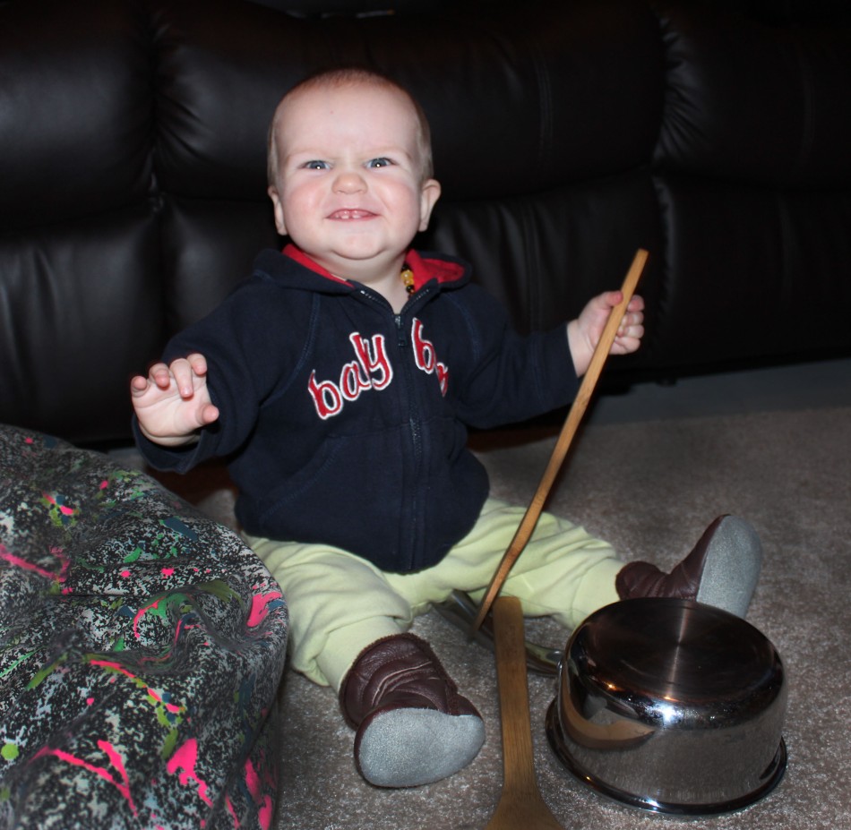
Joy is an expression of happiness and excitement. The first thing that comes to mind when I think of joy is seeing a child try something new for the first time. I took this photo of my nephew Dax. He was ringing in the new year for the very first time. I used the clone stamp and bandage functions in photoshop to eliminate unnecessary distractions so that the viewer can focus on Dax’s facial expressions. I also used the burn function to darken the background so that Dax’s joy really pops. One cannot look at such an expression and not join in with the child’s feeling of joy.
Joy – June

This is my niece June. She is trying blueberries for the first time. The expression on her face is that of Joy. I wanted her to be the focal point of the picture so I made the background black and white, and then used the burn function to darken it. I changed the colour of shirt June was wearing to something brighter and happier. I then brightened June by adjusting the brightness and then put a glow around her. This allows the viewer to really feel the joy that June is experiencing, rather than just see it.
Motion – Person Focus

With a shutter speed of 1/320 and f4.0 ( on my Canon Rebel T4i), I was able to focus on Dori and leave the background unfocused. It would appear as those Dori was frozen in time and not moving, but this was taken as she was walking by.
Motion – Background Focus

Using my Canon Rebel T4i with a shutter speed of 1/125 and f8.0, I was able to focus in on the background while my lovely assistant Dori was walking by.
Complete Focus

With my Canon Rebel T4i set with a shutter speed of 1/30 and f25, I was able to capture all the computers and their parts in focus.
This picture represents the normal view that people have in life. They see everything as a whole and can miss out on the details. Without focusing on a particular part of the computer, we cannot filter what the viewer sees. Simply looking at this photo one will not particularly see the all powerful mouse, or venomous cords.
Front Focus

For this image, my Canon Rebel T4i was set with a shutter speed of 1/500 and f5.6. These settings allowed the focus to be on the mouse.
All things must have controls. The mouse is the control of a computer. With a mouse, the user can control what the computer does. As individuals we have our own individual mouse that guides our actions.
Rear Focus

This image was taken with my Canon Rebel T4i with the shutter speed set at 1/1250 and f5.6. These settings resulted in a focus on the cords erupting for the desk to give life to the computers.
This image represents how computers have “poisoned” everything we do. The digital age affects all things in life and the cords are like a venomous spider sprawling out and infecting everything it comes into contact with.
Wednesday January 9th, 2012
Today begins the dawn of a new era. It is time for me to take my visual communication skills to the next level.
I will begin with my introduction. My name is Brad Zander and I am in my fourth year of my accounting degree at the University of Lethbridge. I have made the decision to add a new media minor to my major. My interest in website design, logo design, and new found interest of my wife of photography have brought me to this new era.
I look forward to expanding my knowledge in this area and expand my career to serve a as a freelance designer to supplement my accounting career.
